Colorblind Paperback Now Available
“Seeing Color Colorblind” is now available at Amazon as a paperback book, in addition to the Kindle e-book version released earlier in April. I am as proud of this 60 page, 8×10 paperback book as I was of my PhD dissertation; maybe more so. It represents a labor of love for the colorblind people who have always been in my life, and whose world I really did not understand until I began this project.
From the Amazon description:
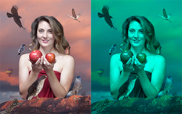
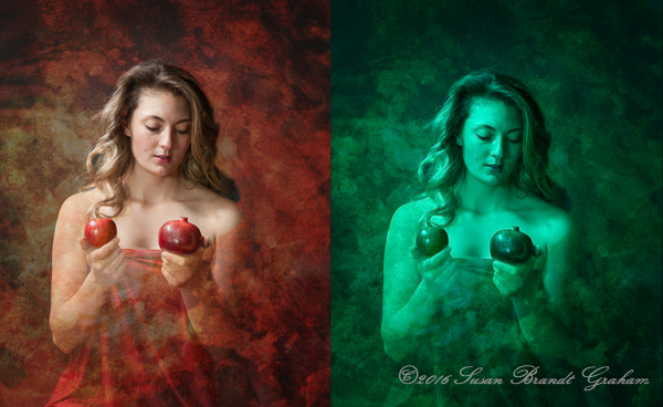
What do colorblind people see? What does the world look like to them? No single “right” answer exists, because there are different types and degrees of what is more appropriately called “color deficient vision.” Formally trained in Anthropology (PhD) and Medicine (MD), Susan Brandt Graham is a photographic artist who has had a lifelong interest in understanding how “colorblind” people see the world. Using the art and technology of digital photography, she unlocks the fascinating world seen by people with severe red deficient vision. From images in her professional portfolio, she creates diptychs that are indistinguishable to her son, who, like his maternal grandfather, has a severe red deficiency. This instructive and affordable volume is useful for people with red deficient vision to explain to others what they see; for family and friends to understand the world of their loved one; for ophthalmologists, optometrists, pediatricians, and other healthcare professionals who diagnose color deficient vision to use in explanation to patients and family/friends; for teachers to help students empathize with classmates who may perceive the world differently; and for anyone who desires to understand how others may see the world.
In the summer of 2015, after seeing the first of many videos from EnChroma, the company that makes special glasses that allow many, but not all, colorblind people to see a wider range of color, I tried experimenting with three of my images to see if I could produce images that my son would see as the same, even though quite different to me. I knew that, at least in theory, those three images should be close. But, I really did not believe the results. I did not think anyone saw the world like that. How could they? I mean, green people? I knew my son did not see me in shades of cyan. It was just too strange.
I posted those images here, and didn’t give it more thought because I did not believe them. I don’t think I even mentioned it to my son until quite a bit later. Some time later, when he saw the three pairs, he said, “Oh, yeah, those look the same to me.” What? The theory that should have worked, but produced results so strange to me I could not believe them at the time, produced results that were real and accurate.
Early this year (2016) I converted a series of additional images, and my son confirmed that each pair really did look the same. We were able to do the work at a distance, using computers, and on April 2, released the Kindle version of “Seeing Color Colorblind.”
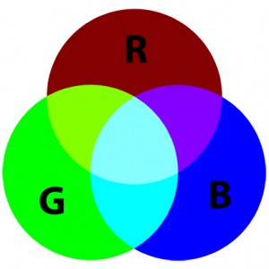
In retrospect, that work was very easy in comparison to producing a print version. Monitors, hand-held devices, and many other things use projected light, in which the primary colors are Red, Green, and Blue, the RGB color space of projected light.
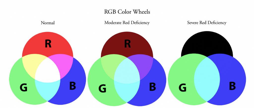
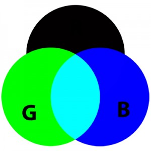
Print versions, such as for books, are done in the Cyan, Magenta, and Yellow color space, which is reflected light. Those are the colors you see if you look at the overlapping areas of the color wheel of the RGB system. For someone with a severe red deficiency, cyan, blue, and green are about the only colors left in that space. Converting the diptychs we had done in the RGB color space was not difficult for me; it is easily done in Photoshop. However, we could not accurately proof CMYK color for print on our RGB monitors. Doing proofs required actual print proofs, and that became a huge challenge.
My friends doing serious digital photography know that the print is in the CMYK color space, but that the photographer does not manage color in that space. You color calibrate your monitor, using one of the devices available for that purpose. When getting ready to print, you proof using the appropriate ICC profile for the particular papers and the particular printer you are using. All of that is done in the RGB color space. In fact, labs for photographic prints tell you not to convert to CMYK, but keep the proof in RGB. When you actually print, your computer talks to the printer’s computer, which is where the conversion is done, and out comes a print in CMYK that matches the RGB “proof” you created on your monitor. Photo books are done this way, but not regular hardcover and paperback books.
I considered photo books, even though they are quite a bit more expensive. None of them produced images that looked the same to my son. We decided to give paperbacks a try. Again, these did not have ICC profiles to apply, and the images had to be submitted in CMYK. Much to my surprise (this has definitely been a learning experience from beginning to end!), the interior images looked the same to my son, but the cover image did not, even though it was the same image used on the interior, where it did match. That cover had a glossy finish. We gave a matte cover a try, and that worked perfectly to my son’s eyes. We finally had our “colorblind paperback!” I would never have thought of using a matte cover, but I actually think it is more attractive. I will use matte covers for work in the future, work having nothing to do with this particular topic.
Although, one of my son’s first responses when this volume was finally done, was “Now you can do a book for colorblind people that shows what everybody else sees…:)” I wish…
This has been quite a journey into the land of color, a very satisfying journey. I’ve lived my entire life with colorblind people – my father and son – and until now had no idea what their world looked like. While I am not overly thrilled with appearing cyan with black lips (kind of “dead” to an Ob/Gyn surgeon), at least I know, and I find the rest of their world quite beautiful in its own right. I wish I could tell my father I’m sorry I told him to quit teasing me and expecting me to believe he and my son were seeing a “blue team and yellow team” on a black and white television years ago, and especially to stop teaching my son to lie like that, even as a joke. The joke was definitely on me, but not in the way I thought at the time.
My son hopes this “colorblind paperback” will help other colorblind people to be better understood, even if they have a different type of colorblindness to which these specific images do not apply. I share that hope.
For those who are interested, this “colorblind paperback” is now available at Amazon. It is 60 pages, 8×10, has diptychs for pink, orange, red, yellow, blue, monochrome, black and white, and skin tones. Green is discussed in some of the images along with a different color with which it appears. Its retail list price is an affordable $19.99.
My Amazon Author Page is, not surprisingly, Susan Brandt Graham 🙂
I thank you for your interest.


