Colorblind Paperback Now Available

This entry is part 3 of 4 in the series Seeing Color Colorblind

Colorblind Paperback Now Available

Seeing Color Colorblind” is now available at Amazon as a paperback book, in addition to the Kindle e-book version released earlier in April. I am as proud of this 60 page, 8×10 paperback book as I was of my PhD dissertation; maybe more so. It represents a labor of love for the colorblind people who have always been in my life, and whose world I really did not understand until I began this project.

colorblind paperback

From the Amazon description:

What do colorblind people see? What does the world look like to them? No single “right” answer exists, because there are different types and degrees of what is more appropriately called “color deficient vision.” Formally trained in Anthropology (PhD) and Medicine (MD), Susan Brandt Graham is a photographic artist who has had a lifelong interest in understanding how “colorblind” people see the world. Using the art and technology of digital photography, she unlocks the fascinating world seen by people with severe red deficient vision. From images in her professional portfolio, she creates diptychs that are indistinguishable to her son, who, like his maternal grandfather, has a severe red deficiency. This instructive and affordable volume is useful for people with red deficient vision to explain to others what they see; for family and friends to understand the world of their loved one; for ophthalmologists, optometrists, pediatricians, and other healthcare professionals who diagnose color deficient vision to use in explanation to patients and family/friends; for teachers to help students empathize with classmates who may perceive the world differently; and for anyone who desires to understand how others may see the world.

In the summer of 2015, after seeing the first of many videos from EnChroma, the company that makes special glasses that allow many, but not all, colorblind people to see a wider range of color, I tried experimenting with three of my images to see if I could produce images that my son would see as the same, even though quite different to me. I knew that, at least in theory, those three images should be close. But, I really did not believe the results. I did not think anyone saw the world like that. How could they? I mean, green people? I knew my son did not see me in shades of cyan. It was just too strange.

I posted those images here, and didn’t give it more thought because I did not believe them. I don’t think I even mentioned it to my son until quite a bit later. Some time later, when he saw the three pairs, he said, “Oh, yeah, those look the same to me.” What? The theory that should have worked, but produced results so strange to me I could not believe them at the time, produced results that were real and accurate.

Early this year (2016) I converted a series of additional images, and my son confirmed that each pair really did look the same. We were able to do the work at a distance, using computers, and on April 2, released the Kindle version of “Seeing Color Colorblind.”

In retrospect, that work was very easy in comparison to producing a print version. Monitors, hand-held devices, and many other things use projected light, in which the primary colors are Red, Green, and Blue, the RGB color space of projected light.

colorblind paperback
RGB Color Wheels

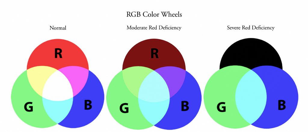
Print versions, such as for books, are done in the Cyan, Magenta, and Yellow color space, which is reflected light. Those are the colors you see if you look at the overlapping areas of the color wheel of the RGB system. For someone with a severe red deficiency, cyan, blue, and green are about the only colors left in that space. Converting the diptychs we had done in the RGB color space was not difficult for me; it is easily done in Photoshop. However, we could not accurately proof CMYK color for print on our RGB monitors. Doing proofs required actual print proofs, and that became a huge challenge.

My friends doing serious digital photography know that the print is in the CMYK color space, but that the photographer does not manage color in that space. You color calibrate your monitor, using one of the devices available for that purpose. When getting ready to print, you proof using the appropriate ICC profile for the particular papers and the particular printer you are using. All of that is done in the RGB color space. In fact, labs for photographic prints tell you not to convert to CMYK, but keep the proof in RGB. When you actually print, your computer talks to the printer’s computer, which is where the conversion is done, and out comes a print in CMYK that matches the RGB “proof” you created on your monitor. Photo books are done this way, but not regular hardcover and paperback books.

I considered photo books, even though they are quite a bit more expensive. None of them produced images that looked the same to my son. We decided to give paperbacks a try. Again, these did not have ICC profiles to apply, and the images had to be submitted in CMYK. Much to my surprise (this has definitely been a learning experience from beginning to end!), the interior images looked the same to my son, but the cover image did not, even though it was the same image used on the interior, where it did match. That cover had a glossy finish. We gave a matte cover a try, and that worked perfectly to my son’s eyes. We finally had our “colorblind paperback!” I would never have thought of using a matte cover, but I actually think it is more attractive. I will use matte covers for work in the future, work having nothing to do with this particular topic.

Although, one of my son’s first responses when this volume was finally done, was “Now you can do a book for colorblind people that shows what everybody else sees…:)” I wish…

This has been quite a journey into the land of color, a very satisfying journey. I’ve lived my entire life with colorblind people – my father and son – and until now had no idea what their world looked like. While I am not overly thrilled with appearing cyan with black lips (kind of “dead” to an Ob/Gyn surgeon), at least I know, and I find the rest of their world quite beautiful in its own right. I wish I could tell my father I’m sorry I told him to quit teasing me and expecting me to believe he and my son were seeing a “blue team and yellow team” on a black and white television years ago, and especially to stop teaching my son to lie like that, even as a joke. The joke was definitely on me, but not in the way I thought at the time.

My son hopes this “colorblind paperback” will help other colorblind people to be better understood, even if they have a different type of colorblindness to which these specific images do not apply. I share that hope.

For those who are interested, this “colorblind paperback” is now available at Amazon. It is 60 pages, 8×10, has diptychs for pink, orange, red, yellow, blue, monochrome, black and white, and skin tones. Green is discussed in some of the images along with a different color with which it appears. Its retail list price is an affordable $19.99.

My Amazon Author Page is, not surprisingly, Susan Brandt Graham 🙂

I thank you for your interest.

Colorblindness – New Release

This entry is part 2 of 4 in the series Seeing Color Colorblind

Colorblindness – Seeing Color Colorblind

“Colorblindness,” more accurately color deficient vision, affects 8-10% of people in the US. Roughly 10% of those, or a total of 1% of the US population, have a severe red deficiency, called protanopia.

“Seeing Color Colorblind” is now available in Kindle format from Amazon. The book contains a series of diptychs showing images as seen by people with normal color vision, and how they are seen by someone with a severe red color vision deficiency – “colorblindness.” There are different types and degrees of what has been labeled “colorblindness.” These images speak to severe red deficiency or protanopia, the type of color vision my father had and my son has. My son sees both sides of the diptychs in the Kindle as the same. Yes, I know it is very surprising to see for the first time – and the tenth time.

protanopia colorblindness
Seeing Color Colorblind: Pomegranates

A preview of the Kindle is here:

Susan’s Amazon Author Page

In the coming months look for hard copy formats as well.

Seeing Color

seeing color

Seeing Color

Seeing color: pretty simple for a color sighted person. It is so natural, it is easily taken for granted without much thought. That has been true for me until recently, in spite of the fact that color is so important to me in all aspects of my life and in spite of the fact I have lived with and been around colorblind people my entire life.

I began to give seeing color much more thought when I saw a beautiful video showing some colorblind people seeing color for the first time using EnChroma glasses, specifically designed to help colorblind people see color.


Seeing the video made me recall so many things about my father and son to which I had not given much thought in years. After seeing it, I wrote elsewhere:

This beautiful video allowed me for the first time to perhaps glimpse the world as my colorblind father saw it and my colorblind son sees it. My father has passed on, but he would have loved the chance to try these glasses. On vacations he always had trouble with traffic lights, until the positions became more standardized. The video gave me such a vivid example of why. My mother grew beautiful flowers, and he always tried to appreciate them, but the passion just wasn’t there. Once again, the video allowed me to understand why.

I knew from high school genetics that any son of mine would have a 50% chance of being colorblind, so when he was, it came as no surprise. I don’t even remember how old he was when we all realized it, but I’m sure it was when he was quite young. When he was a child, he always wanted black balloons. After seeing the video where the balloons were washed-out shades of blue and yellow to a colorblind person, I can really understand why. Black would stand out among those colors.

When my father was alive, the two of them together were a hoot, and they saw the world pretty much the same way. I’ll never forget listening to them the first time they watched a football game together and they were talking about “the blue team and the yellow team.” Even though I knew perfectly well they were colorblind, I thought they were putting me on! I came to realize that was not a joke, and how really differently they saw the world. The video, showing how the balloons would appear to a colorblind person, helped me “see” for the first time what the two of them were seeing: yellow and blue!

Being colorblind in the same way was, I believe, an additional strength to the grandfather-grandson relationship. Each had someone who understood without explanation what the other saw. In reading through some of the stories here, I appreciate even more how fortunate both of them were in that respect.

In spite of that mutual support, I cannot count the number of times my son has said, “I wish I could see the world the way other people see it, even if just once and just for one minute.” I never dreamed that could perhaps be possible for him.

I cried when I first saw this video, and I must have watched it at least 20 times. When my mother watched it, her first response was, “I wish these had existed when your father was alive.” Her second response was, “My grandson has to have a pair of these to try.” We will not know, of course, until he tries them how he really will see the world through them. But we all have hope that he will be able to see color like the people in the video (and other videos), and not “just once, even for just a minute,” but maybe for a very long time.

Regardless of the outcome with that, I appreciate the video for allowing me to begin to understand just how my father saw and my son sees the world.

I began to try to learn a lot more about colorblindness. I knew there were many kinds and degrees of colorblindness, and that red-green was the most common, but I had not known there were different types of red-green colorblindness. One type is helped more readily by the new glasses, one type not helped so much. I became really aware of that when I saw another video with a colorblind boy with the latter type trying to sort crayons without and then with his EnChroma glasses:

After I learned the type my son has and my father had, I re-read the EnChroma site:

Significant Color-Name Confusion

Green, brown, yellow, orange, and red may appear confusingly similar. This makes “naming” the color difficult. (I remember as a little kid trying to “teach” my father his colors. He was pretty patient with that.)

Difficulty with Traffic Signals

Green lights may appear to be white. Yellow and red lights may appear indistinguishable, especially at night.

Distorted Color Perception

For people with normal color vision, there is universal agreement on what certain “unique colors” look like. However due to the significant spectral shift of the L-cone, strong protans may perceive these colors to have different spectral locations, for example, something as ordinary as peanut butter, which should look brown, appears to be green for someone with color blindness!

From the always wonderfully scientifically accurate source, Wikipedia 😉

Protans have difficulties to distinguish between blue and green colors and also between red and green colors. It is a form of dichromatism in which the subject can only perceive light wavelengths from 400 to 650 nm, instead of the usual 700 nm. Pure reds cannot be seen, instead appearing black; purple colors cannot be distinguished from blues; more orange-tinted reds may appear as very dim yellows, and all orange-yellow-green shades of too long a wavelength to stimulate the blue receptors appear as a similar yellow hue. It is hereditary, sex-linked, and present in 1% of males.

I became more and more interested in trying to imagine what the world must have looked like to my father and now to my son. I believe the Enchroma video shows a milder form of red-green colorblindness. It definitely helped me see some things and begin to think about the issue, but I wanted to see if there was any way I could “see” what my son saw. There are sites on the internet that allow one to upload images and then see how they would look to colorblind people. Some are of the type father had and my son has, but I believe not as severe. I tried to think how I could “imagine” such a different way of seeing. And, then it occurred to me. Light is perceived in the red, green, blue wavelengths and their combinations. The cones in normal colorsighted people are red, green, and blue. For severe protans, red is severely deficient, so much so that pure red is often perceived as black.

Putting all that I recently have read about colorblindness together, and thinking about how photoediting software makes use of the RGB (red, green, blue) nature of visible light, I experimented with some images. I cannot say that anyone but me sees these colors this way. I also, even for myself, cannot be certain of saturation, because I do not know how that varies even among color sighted people, to say nothing of colorblind people. But I do know that by manipulating the relevant color channels, I produced images that replicate the descriptions given (see above). For some of the images I also attempted to produce images that might be how the glasses alter the vision of a severe protans. This I am even much less certain about, but I took into account what my son has told me so far: he sees some things as pink where he never saw them as pink before, and the glasses make yellows much less vivid for him.

Example 1 – The Orange Floribunda Rose, ‘Marmalade Skies’

seeing color
Orange Floribunda Rose, ‘Marmalade Skies’
seeing color
How Orange Rose, ‘Marmalade Skies,’ Might Be Perceived by Someone with Severe Protanopia
seeing color
How That Same Rose Might Be Seen With EnChroma Glasses

Example 2 – The Miniature Rose, ‘Marriotta’

seeing color
Miniature Rose, ‘Marriotta’
seeing color
‘Marriotta’ as Might Be Perceived by Someone with Severe Protanopia
seeing color
With EnChroma Glasses – Perhaps

Example 3 – The Large Flowered Climber, ‘Fourth of July’

seeing color
Large Flowered Climber, ‘Fourth of July’
seeing color
‘Fourth of July’ As Might Be Perceived By a Severe Protans
seeing color
With EnChroma Glasses – Perhaps

I have done many more in this series with flowers, but they offer nothing new from the ones posted here. So, I’ll save them for a bit.

But, in reading in a forum, I became aware that to many red-green colorblind people, skin has a greenish cast. That made me want to try to picture what I might look like to my son.

seeing color
Mother – As She Sees Herself
seeing color
Mother – As She Might Be Perceived By Her Son
seeing color
Mother – As She Might Be Perceived with EnChroma Glasses. This Might Be Overly Optimistic.

Added April 28, 2015:

seeing color
Mother – this might be closer to what she might look like with EnChroma glasses

My son has described his experience with the EnChroma glasses to date with the one word, “Interesting…” That is the one word I can think of at the moment to describe my response to this little exercise in trying to understand how my father did and my son does see the world. I do not know how accurately these images reproduce their world. I definitely believe there is some degree of similarity to their worlds of color.

[eta: my son confirms that the first two images in each set of three “look exactly the same to me…The third picture in each group looks different.”]

One thing this exercise has definitely taught me is to appreciate my seeing color, and not take it for granted. I will appreciate even more every attempt my son makes to say something about my flowers when he visits. And, I will continue to hope advances in color vision will continue to be made. People don’t die from not seeing color, but color contributes so much joy to life.

Show Buttons
Hide Buttons
%d bloggers like this: